UX Checklist for UI Components
Brand Guidelines
This checklist is designed to help UX designers create components that deliver a consistent, accessible, and user-friendly experience across TxDOT’s digital design system. It focuses on high-level principles that support usability and compliance without adding unnecessary complexity. Use it as a quick reference during design and review to ensure every component meets core UX standards.
Important: This checklist is high-level and applies to all components in the digital design system. Specific accessibility requirements take precedence over those listed here.
Purpose & Clarity
- Does the component have a clear, single purpose?
- Is the component name descriptive and consistent with the design system taxonomy?
- Does the component avoid unnecessary complexity?
Accessibility (WCAG 2.1)
- Color Contrast: Text and interactive elements meet WCAG AA contrast ratio (4.5:1 for text, 3:1 for large text and graphic elements).
- Keyboard Navigation: Component is fully operable via keyboard (Tab, Enter, Space).
- Focus States: Visible focus indicators for all interactive elements.
- ARIA Roles & Labels: Correct semantic roles and accessible names applied.
- Touch/Click Targets: Minimum 44px by 44px for interactive elements on mobile and 24px by 24px on desktop.
Interaction & Feedback
- Does the component provide clear feedback for user actions (hover, active, disabled states)?
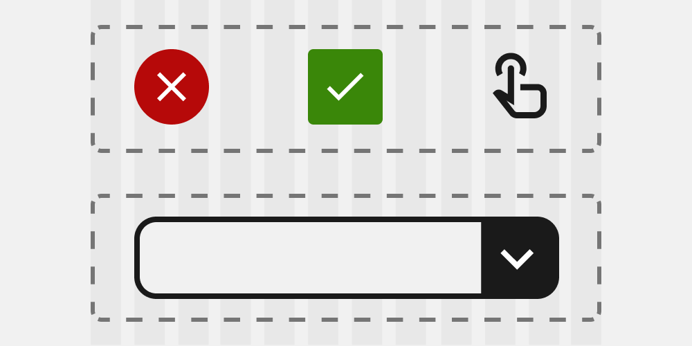
- Are error states and success states clearly communicated?
- Are animations or transitions subtle and not blocking interaction?
Consistency
- Does the component follow TxDOT brand guidelines for typography, color, and spacing?
- Are icons and imagery consistent with the design system?
- Does it align with established interaction patterns?
Content
- Is text concise, clear, and written in plain language?
- Are labels and instructions contextually relevant?
- Does the component avoid jargon or abbreviations without explanation?
Performance & Technical Feasibility
- Is the component optimized for fast load times (minimal assets, no unnecessary scripts)?
- Does it scale well for responsive layouts (mobile, tablet, desktop)?
- Does it avoid heavy dependencies that could impact performance?
Testing & Validation
- Has the component been tested for usability with real users or representative scenarios?
- Does it pass automated accessibility checks (e.g., Stark)?
- Is it documented in the design system with usage guidelines?