Typography and fonts
Visual identity
Typography is an important part of TxDOT’s visual identity. Below is information for the official TxDOT brand fonts.
Best practices
Follow these best practices to improve readability of your content for digital and print.
- Use upper and lower case for headlines.
- Use different sizes and weights to create content hierarchy.
- Set content line lengths between 50 – 75 character for digital and 45 – 90 characters for print.
- Use TxDOT blue or black for headlines.
- Use fonts listed below.
- Don't use all caps for two (2) lines or more.
- Don't use TxDOT red for written content.
- Don't add a dropshadow to content.
- Don't squish or stretch written content.
- Don't use fonts that aren't listed below.
- Don't use colors that aren't listed in TxDOT brand guidelines
Approved brand fonts
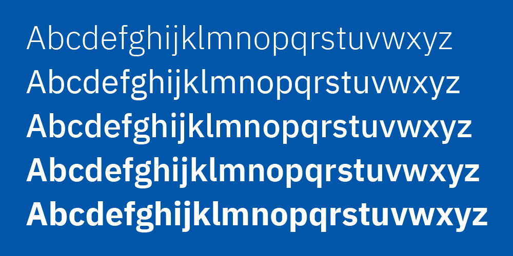
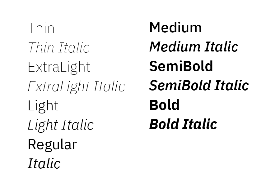
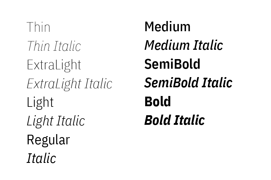
Only use the approved brand fonts listed below. The primary typeface/font for communications is IBM Plex Sans. It has two versions, regular and condensed, which provide a range of weights.
IBM Plex Sans
IBM Plex Sans Condensed
Font alternative
When IBM Plex Sans—the official TxDOT brand font—is unavailable due to technical or platform limitations, use the following font cascade to maintain visual consistency: Verdana, Aptos, Arial, and finally Sans Serif. This sequence ensures accessibility and readability across systems while preserving the integrity of the brand’s typographic style.
Important: All TxDOT brand templates are built using Verdana and do not require installation of IBM Plex Sans.
Getting brand fonts
IBM Plex Sans and IBM Plex Sans Condensed are available for free from Google fonts.
Accessibility best practices
- Color contrast between text and background colors should be 4.5:1.
- Content must be 10 points/pixels in size or larger.
- Body content line spacing must be 1.5 times the font size.
- Content must not rely on color alone to communicate information.
- Use clear and direct language and avoid jargon.
- Consistently use typographic styles for headings and body content.