Editorial icons
Visual identity
Editorial icons are custom illustrations that support a consistent and recognizable brand presence while supporting visual storytelling. They represent concepts and themes in expressive ways, helping users quickly scan, understand, and engage with content.
Access editorial icons
- Editorial icons are preloaded into TxDOT.gov and the intranet's digital file repository, simply search for "icon".
- Vendors should request the files from their TxDOT point of contact.
- If you need a custom editorial icon, submit a request to Creative Services Brand & Design team.
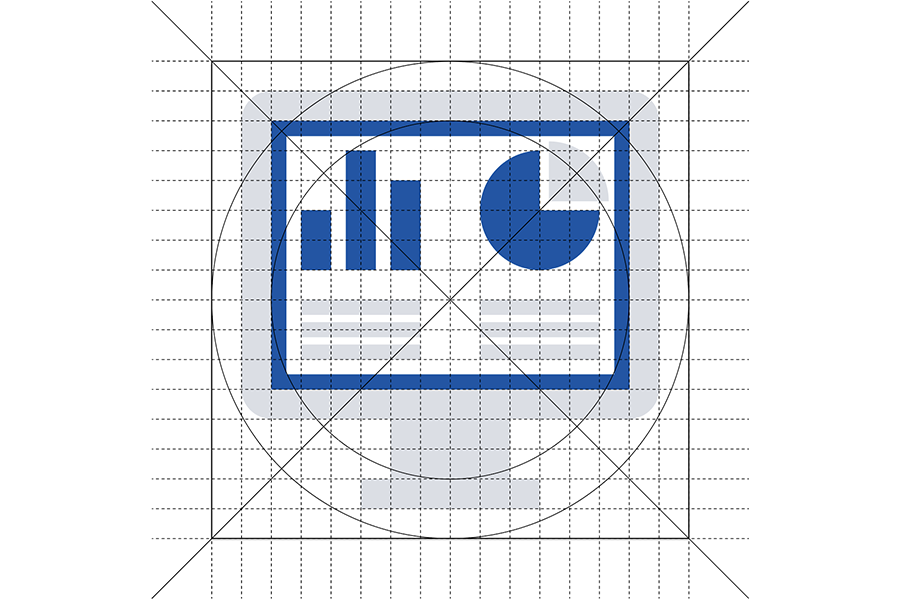
Editorial icon specifications
Follow these guidelines to ensure editorial icons maintain a consistent, brand-aligned visual style:
- Artboard size: 1024 × 1024 pixels
- Corner radius: 64 pixels
- Stroke weight: 32 points
- Color palette: TxDOT primary blue, light gray, and white (see details below)
- Color mode: RGB for digital use; CMYK for print
- Typography: Use brand font IBM Plex Sans; limit text to symbols or single characters (e.g., $)
- Grid system: Use a 32 by 32 visual grid for visual alignment consistency
- Alignment: Snap shapes and strokes to the grid
Production prep for web use
To prepare editorial icons for web use, follow these steps:
- Check the Digital Asset Management (DAM) system before uploading to see if the icon already exists
- Convert strokes to shapes to ensure consistent rendering
- Merge same-color graphics into single paths for reduced file size (example below)
- Name shape path/layers by color for CSS styling:
- Name blue shape path "icon-color-1"
- Name light gray shape path "icon-color-2"
- Name white shape path "icon-color-3"
- SVG code for each color shape or path should include the above layer name as an ID (e.g., <path id="icon-color-1">)
Icon colors
Primary Blue
HEX: #0056a9
CMYK: 100 / 69 / 0 / 0
Light Gray
HEX: #dadee5
CMYK: 13 / 8 / 5 / 0
White
HEX: #FFFFFF
CMYK: 0 / 0 / 0 / 0
Icon use best practices
- Use editorial icons when:
- Images aren’t available and reference-style icons don’t fit the context
- The subject is distinctive or conceptual, such as Traffic Cameras, Computer Servers, or other unique content types
- Editorial icons visually convey complex ideas in a simple, consistent way, reinforcing brand identity and enhancing the overall user experience.
- Use descriptive titles and filenames that reflect the icon’s content like computer-screen-displaying-data-icon.svg.
- Don't use when an image would better communicate the content.
- Don't use when content is hard to illustrate.
- Don't include context in file names like 2025-progress-report-innovation-icon.svg