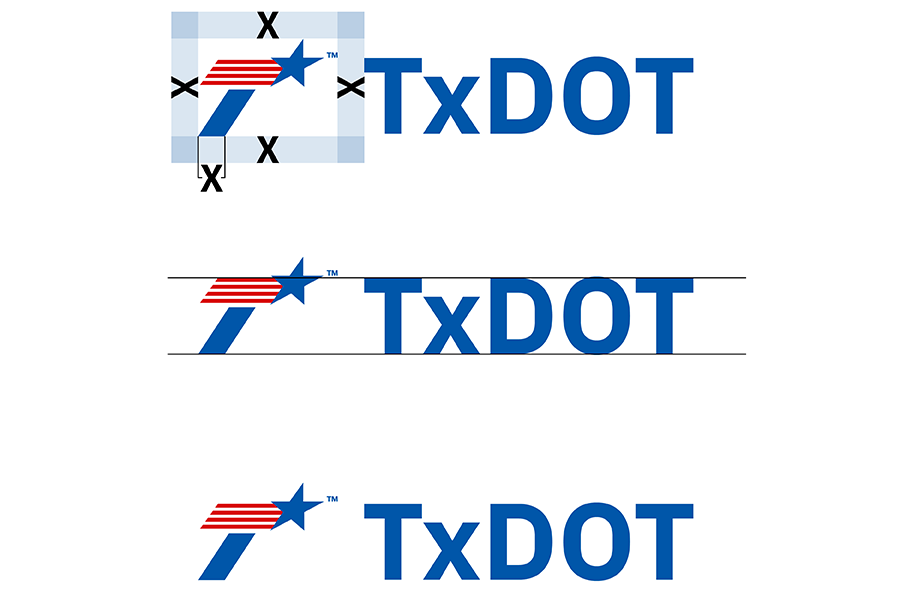
TxDOT logo small use
Visual identity

When logo size must be reduced below the required minimums for the vertical and horizontal logo, use the TxDOT icon (flying T) paired with “TxDOT” in plain text, in approved brand fonts. This approach preserves brand recognition while ensuring legibility at small sizes.
Guidelines
- Make sure the TxDOT icon has the required clear space between the icon and text (see diagram above).
- Aligin the text baseline and cap height with the baseline and cap height of the icon (see diagram above).
- Use brand approved fonts.
Avoid these mistakes
- Don't use the horizontal or vertical logo below their required minimum sizes.
- Don’t alter or modify any TxDOT logo to fit into a small space.
- Don’t use unapproved fonts or create custom logo lock ups.
Exceptions
-
Personal Protective Equipment (PPE) and safety campaigns (e.g. Don’t Mess with Texas, Drive like a Texan, etc.) may be permitted to use the TxDOT logo at smaller sizes. Consult with the Creative Services in the Communications Division for approval.
-
Creative Services is the sole organizational unit authorized to develop special-use versions of the TxDOT logo. Use of any such logo requires prior approval from Creative Services.