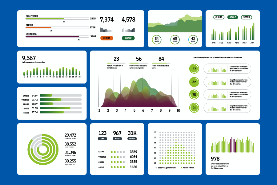
Consistency with TxDOT's brand is important when developing data visualizations and dashboards. Tableau is frequently used for TxDOT visualizations, and these guidelines are primarily created with this software in mind.
The resources and guidelines in this section are specifically for data visualizations and not applicable to forms of media.
Resources
Best practices and information
What is data visualization and why is it important?
Data visualization transforms data and abstract information into visual formats such as graphs, charts, diagrams, and illustrations. Visualizing information uncovers insights that might remain hidden in raw data like patterns, trends, or correlations.
Digital accessibility
Data visualizations help us understand complex information and it’s a requirement for the information to be accessible. TxDOT adheres to current federal Web Content Accessibility Guidelines (WCAG). TxDOT employees can find more information on TxDOT's intranet in the Communications Division section.
