Featured articles
Component library
How to use this component
Use the Featured Articles component to highlight and link to selected content pages, including pages in AEM or external links. It supports two layout options—a horizontal row layout or a featured layout that emphasizes a single item.
Featured Articles highlights and links to related content with an image and optional brief description.
View video transcript for Featured Articles component
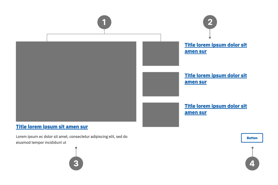
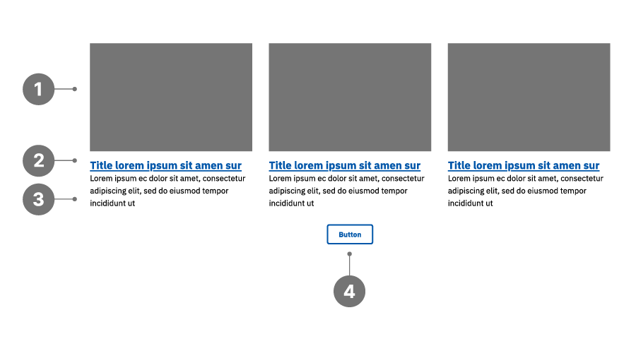
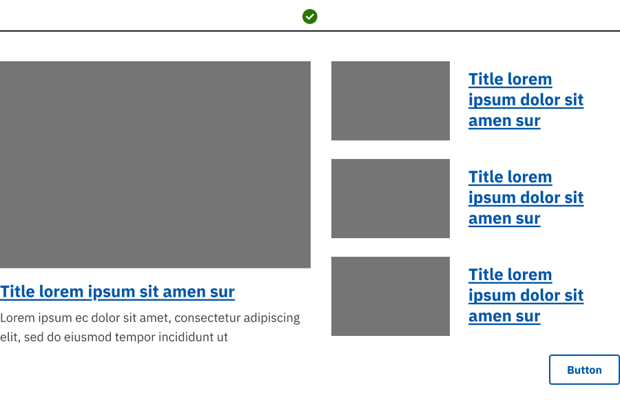
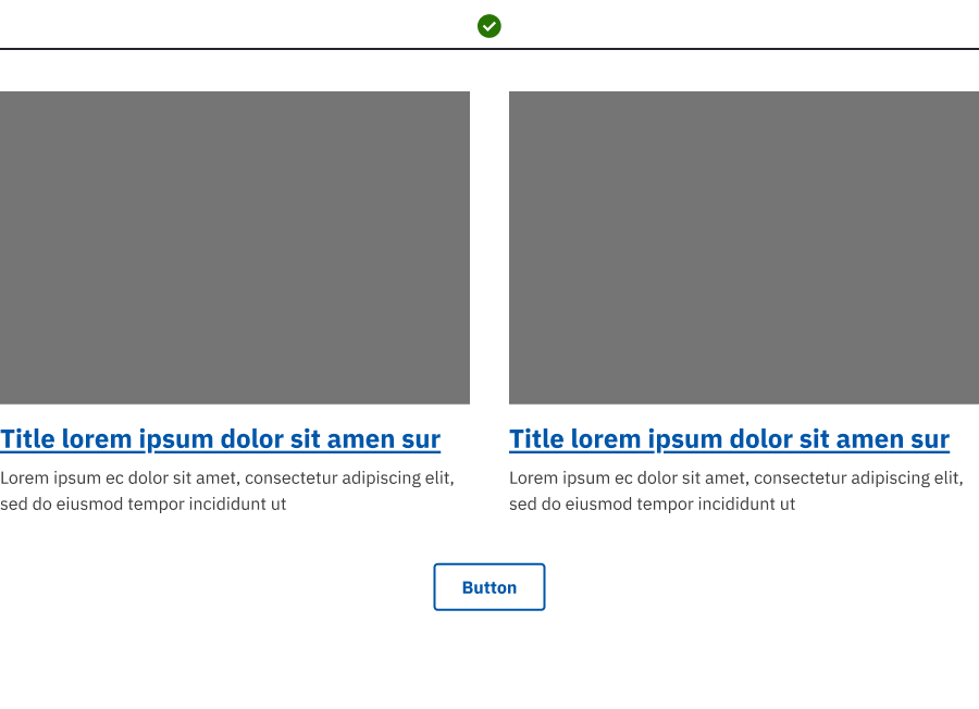
Featured Articles anatomy
- Image
- Title
- Description
- Button (optional)
Featured layout
Horizontal layout
Best practices
- Use consistent image sizes, ensuring uniform aspect ratios. (900x600px)
- Provide essential, summarized information.
- For horizontal layout, make all Descriptions of comparable length.
- Provide descriptive titles since these will be the text links for each item.
- Avoid displaying more elements per row than the actual number of articles.
- Avoid mixing different types of content within the same Featured Articles component.
Examples
Bad example:
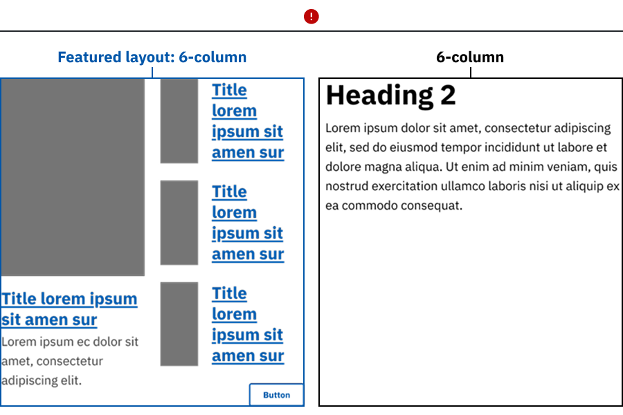
- The Featured Articles component is placed in a narrow column span (6:6 or smaller), causing the featured layout to lose emphasis.
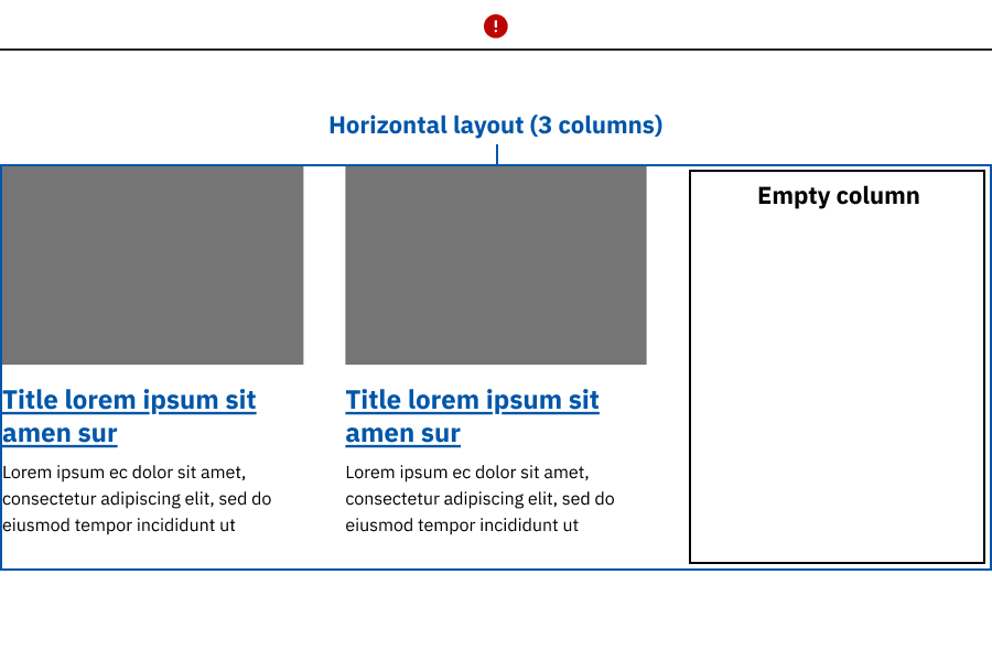
- The layout uses more columns than available articles, leaving empty space and visual imbalance.
- An uneven number of articles is shown in a multi‑column layout, resulting in unused space and misalignment.
Good example: Featured Articles uses wide column spans, with the featured or horizontal layout selected to match the number of articles displayed and support clear visual balance.
Placement
Place the Featured Articles component in wide, main content areas.
Featured Articles characteristics
- Works best in wide column spans; use at least 9 columns in 9:3 layouts.
- Uses linked titles to navigate to related or detailed content.
- Optional call‑to‑action button can be used to expose additional related articles.
- Featured layout requires authors to designate a primary article in configuration. Authors should intentionally feature a primary article rather than relying on recency or default ordering.
Accessibility considerations
- All images should have descriptive alt text.
- All buttons and links should have unique and descriptive text. For example, you should not have multiple buttons on a page that all say "Read more."
Web coordinator checklist
- Determine content: Decide the number of cards needed (up to four per row). Ensure each card has an image, title and link and optionally a text description.
- Style selection: Choose between horizontal layout in rows, or the Featured layout with one prominent, primary article.
- Horizontal layout support any number of items, but do not include so many that you overwhelm the end user with choices.
- Featured layout must use 3-4 items only. If more than four are included, only the first four will display.
- Image consistency: Use images with the same size and aspect ratio. Check the decorative image checkbox for non-informative images.
- Link configuration: Use descriptive titles since these will be your link text. Ensure documents and external links open in a new window.
- Content uniformity: Maintain consistency across all items in terms of included elements (e.g., all have descriptions if one does).
Updated May 7, 2026