Table
Component library
How to use this component
Use the Table component to display and organize data effectively. Select this component whenever you need to present tabular data clearly and accessibly.
The Table component displays structured data in a grid format, with options for headers, sorting, and search functionality.
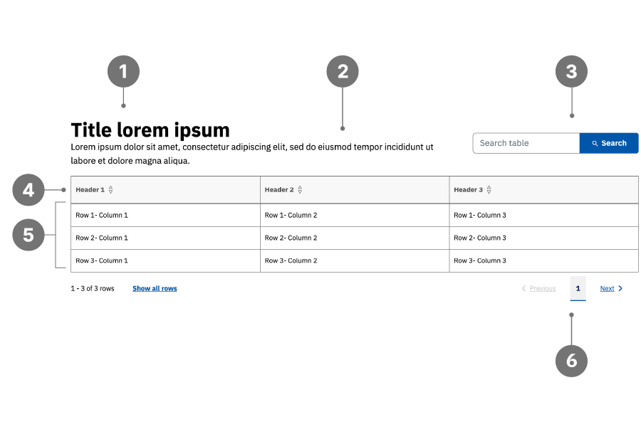
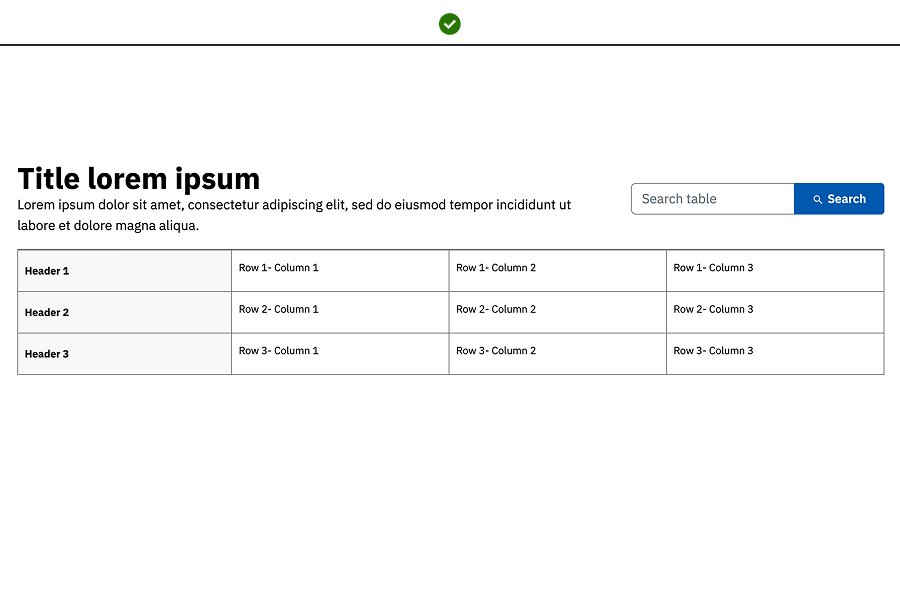
Table anatomy
- Title
- Description
- Search
- Top header row / Left header column
- Table body
- Pagination
Best practices
- Enable the search field for larger tables to improve data navigation.
- Follow heading conventions (H2–H6) for the table title’s heading level.
- Use multiple table components for distinct datasets to improve clarity.
- Organize tables with either a top header row or a left header column for accessibility.
- Do not use tables for layout purposes; use the Column Layout component instead.
- Do not combine multiple tables into one component.
Examples
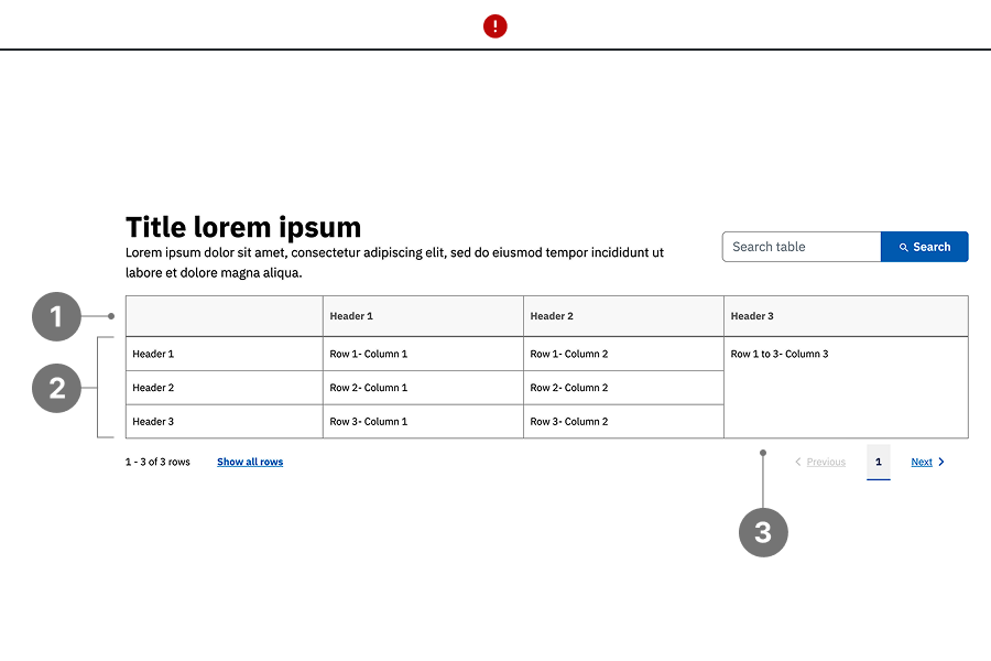
Bad example:
- The table includes an empty header row, which reduces clarity and accessibility.
- Multiple distinct datasets are combined into a single table, making the content harder to scan and understand.
- Cells are merged without a clear structural purpose, making the table harder to scan and interpret. For example, a single merged cell is used in place of distinct entries such as “Row 1 – Column 3,” “Row 2 – Column 3,” and “Row 3 – Column 3.” This reduces clarity and may impact screen reader support.
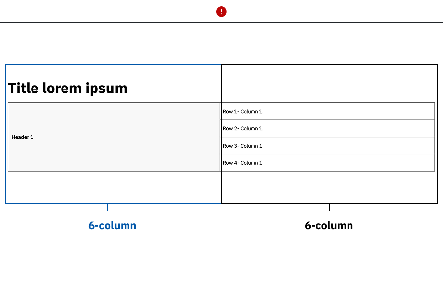
Bad example:
- The table is used to replicate a Column Layout component and present list-style content, instead of using a bulleted or ordered list.
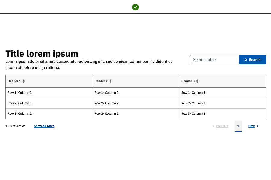
Good example: The table uses clear header rows or columns, with each data point presented in its own cell to maintain structure, readability, and accessibility.
Placement
Tables can be placed anywhere below the H1 title on the page, however ensure tables have a sufficient column width.
Table characteristics
Tables support adding images within cells for additional context; open the asset side panel and drag and drop images into the desired cell.
Accessibility guidelines
- When authoring the table, be sure to give it a unique and descriptive title.
- Ensure tables are organized with a clear header row or column.
- Headers should describe the data they pertain to, improving screen reader navigation.
- Avoid using tables for non-tabular data to prevent accessibility issues- this means, don't use tables just for page layout purposes.
- If an image is added to a cell in a table, be sure to apply alt text to it in the Table Component editor as well as type an image caption in the cell that contains the image in order to make it searchable.
- If any links are present in the table, be sure they have unique and descriptive link text, and are underlined.
Web Coordinator checklist
- Ensure a header row or column is present and accurately describes the data.
- Activate the search field for tables with more than three rows.
- Avoid fixed column widths; ensure the table adjusts to different viewports.
Updated May 20, 2026