17.3 Presentation of Results
Traffic analysis results can be presented in three formats: tabular, graphical, and animated (microsimulation/microscopic analysis only). These visual presentation methods can be supported by text.
Appendix R, Section 3 – Tool Outputs
show examples
of outputs from various software, including commonly used outputs from Synchro.17.3.1 Tabular Summaries
Table summaries can organize data in a way that is easy for the reader to absorb and analyze. Raw data used to compile information in the tables can be included in the appendix for reference. A tabular format can be used to easily make comparisons between alternatives. provides an
example
of failing conditions noted with white text on a black cell background.
Figure 17-1: Pass and Fail Cell Formatting
Tables are one of the simplest forms of data presentation used to summarize a large amount of data. They help with explaining data so that the reader can easily find information and draw general conclusions. Borders for all tables can be solid black or white lines with a 1-point weight. Detailed spreadsheets and tables can be included in appendices. An
example
of tabular data is shown in Intersection | Approach | Turning Movement | Volume (veh) | Delay (sec/veh) | Approach Volume | Approach Delay | Approach LOS |
|---|---|---|---|---|---|---|---|
Street A @ Street B | NB | NBL | 30 | 66 | 94 | 46.5 | D |
NBT | 26 | 66 | |||||
NBR | 38 | 17 | |||||
SB | SBL | 893 | 45 | 1,254 | 38.7 | D | |
SBT | 21 | 48 | |||||
SBR | 340 | 21 | |||||
EB | EBL | 259 | 64 | 1,654 | 48.4 | D | |
EBT | 1,369 | 46 | |||||
EBR | 26 | 11 | |||||
WB | WBL | 56 | 46 | 1,733 | 28.1 | C | |
WBT | 1,232 | 35 | |||||
WBR | 445 | 7 |
17.3.2 Graphical Presentation
Diagrams and illustrations can show the results and allow the reader to draw general conclusions without reading the narrative. These graphics are an effective resource for quickly communicating assumptions, findings, and recommendations.
Common graphical exhibits in reports include:
- Area, land use, and zoning maps;
- Turning movements at intersections;
- Local streets and highway system;
- Lane schematics;
- Link-node diagrams;
- Circulation routes; and
- Centerline alignments
These graphical exhibits can be generated in tools such as Tableau, GIS, or a database inventory/repository.
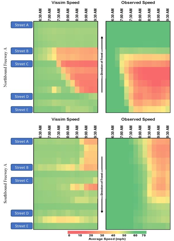
To maximize readability and effectiveness, report illustrations can include text of a reasonable font size and be limited to three layers of information, such as average speed by location and time. shows an
example
of data in a graphical formatFigure 17-2: Example of Speed Data as Graphical Presentation
17.3.3 Animation
Microsimulation animates individual trajectories from the model to demonstrate traffic operations and potential solutions. Animation is an effective visual tool to present traffic analysis results to non-technical audiences or to communicate complex geometries or alternative intersections. Animations can be created from portions of simulation results that most accurately illustrate results and findings. Effects of traffic operations improvement alternatives compared side-by-side using animations can be presented at public meetings or on project websites to further the goals of the project. Each side-byside display can be prepared with the same traffic load to provide the most accurate comparison. It is recommended that animation only be used to enable a general understanding of operations – glitches or incorrect coding could cause the public to be distracted by insignificant details that are not representative of the proposed operations solution.
Animations can be used to complement graphics and/or tables but may not serve as the only method to communicate results for a study. Animation provides only a qualitative assessment of an alternative for a limited timeframe. Additionally, a simulation run shows a single output, while measures of effectiveness are typically calculated using the averages of multiple runs.
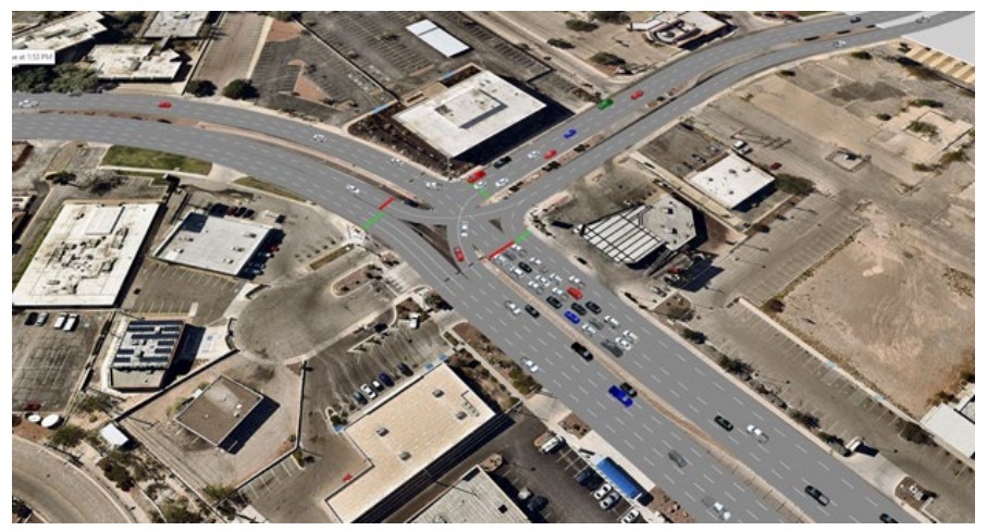
When presented in reports, screenshots of animations can be supported with explanatory text and descriptions. A screenshot of an animation from a Vissim model is shown in to illustrate a CGT.
Figure 17-3: Screenshot of a Vissim Animation
17.3.4 Style Guide
17.3.4.1 Branding and Wordmark
The TxDOT branding and logo are critical to the organization’s identity. The correct wordmark or written identity for the Department is either “Texas Department of Transportation” or “TxDOT.” As with other acronyms presented throughout the document, define TxDOT upon first reference. Never capitalize all letters in the Department acronym (“TXDOT”).
The official TxDOT logo has three layout options, vertical, horizontal, or icon. The vertical logo option is shown in . Alteration of the logo—including disproportionate resizing, modifying logo colors, symbols, or fonts, adding effects to the logo, or deviating from one of the three layout options— is prohibited. The logo is intended to be incorporated in internal and external materials, including reports.
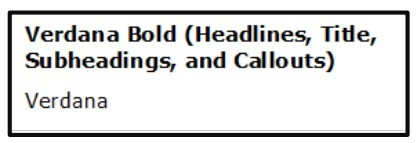
The preferred font is Verdana. Verdana Bold can be used for headlines, titles, subheadings, and callouts, and Verdana can be used for standard body copy (text). Preferred fonts are shown in .
For more information on TxDOT branding guidelines, see
Appendix R, Section 4 – External References (Reference 1).
Figure 17-4: TxDOT Vertical Logo

Figure 17-5: TxDOT Preferred Fonts
17.3.4.2 Printability
All document content, including graphical elements, are recommended to be readable and decipherable when printed and displayed in black and white. It is recommended that any colors used to highlight key information maintain a distinguishable shade from standard text when the document is reproduced in black and white.
17.3.4.3 Readability
Though information is typically reviewed and analyzed by TxDOT staff or practitioners partnering with TxDOT, content is recommended to be easy to understand by both technical and non-technical audiences.
17.3.4.4 Document Structure
To make content easy to follow, logically divide the document into an intuitive flow of narratives with supporting summary tables and graphics grouped according to topic. This not only provides a readable format for the document but also makes it easier to reference sections or specific data
17.3.4.5 Acronyms
Except for common, widely known and used acronyms, it is suggested that acronyms be limited. Common acronyms include TxDOT and HCM. The use of too many acronyms decreases narrative readability, even if readers understand their meaning. When using an acronym, define it when first used. For longer reports, consider attaching a glossary of all acronyms used in the appendix.