
Dive into TxDOT brand guidelines to create clear and consistent communications. These guidelines serve as a resource to ensure our brand is strong and recognizable.
For additional info visit the brand guidelines general information page.
Why does consistency matter?
Consistency is key in building trust and recognition among our audiences. By adhering to our brand guidelines, we ensure TxDOT is accurately represented in a cohesive manner.
Visual identity
Explore the elements of our visual identity including logo, typography/fonts, colors, and more. Consistent use visual elements ensures brand alignment.
Review visual identity infoFeatured Resources

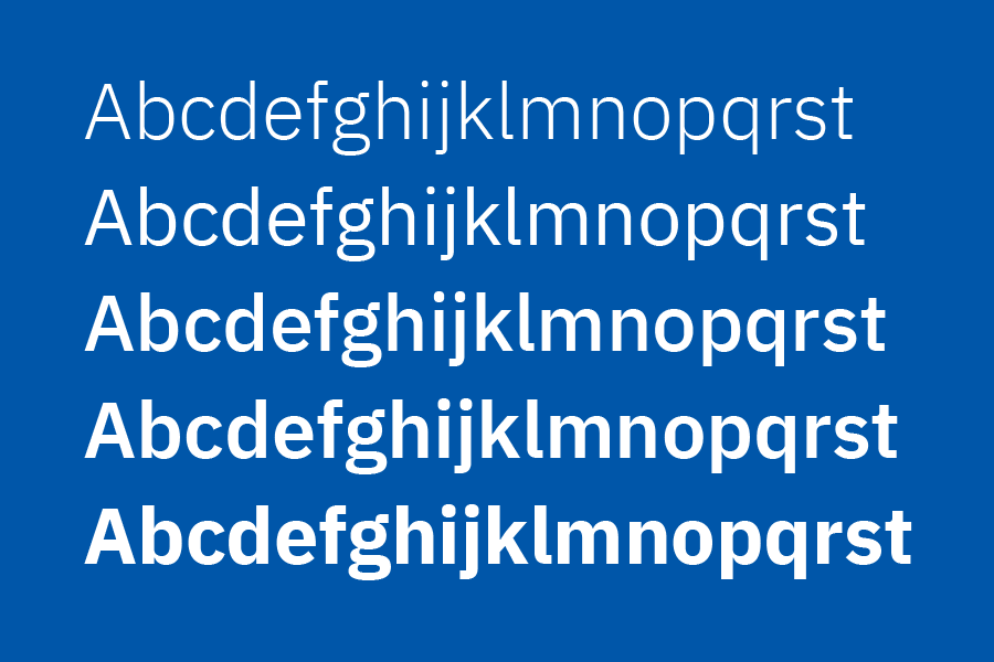
Typography is vital in conveying tone and style. Explore official fonts.


Looking for brand templates?
See samples designs of our ready-to-use templates for presentations, flyers, documents, and more, provided by the Communications Division.
Explore samples