4.2 Walls
TxDOT’s
and the respective
provide information on the physical placement and structural detailing of walls. This section deals with the aesthetics of walls, including the visual relationship to the surrounding landscape and the selection of finishes and surfaces. The
provides information on the physical placement and structural detailing of walls.
4.2.1 Wall Types
4.2.1.1 Sound Walls
Sound walls are typically vertical masonry or precast stacked concrete panels between steel columns, with aesthetic treatments for color and texture (depending on location). Suburban, Urban, and Urban Core roadway contexts are best suited for this solution.
Sound walls are the most used form of noise abatement and are the only form of noise abatement required for consideration on Federal or Federal-aid projects in accordance with
23 CFR §772.13
. Sound walls are solid obstructions built between the highway and the receivers along the highway. Effective sound walls can reduce noise levels by 10 decibels, cutting the loudness of traffic noise in half.The advantages of sound walls are:
- Noise reduction between 5 -10dB(A), reducing traffic noise by as much as one-half; and
- Aesthetic treatment of walls provides area context and continuity.
The possible disadvantages are:
- Noise ‘bleed through’ where multiple driveways/medians may occur; and
- Increased construction costs.
4.2.1.2 Mechanically Stabilized Earth Walls
MSE walls make up the majority of TXDOT walls and provide an incredible palette for different textures, patterns, and colors within the roadway landscape.
4.2.1.3 Concrete Block Walls
These comprise a smaller portion of TxDOT walls. Concrete block walls are especially suited to areas where tighter curves may be needed, or where tiers of walls might be appropriate (shown in
).
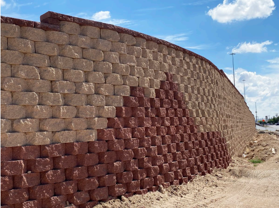
Figure 4-10: Concrete Block Walls
4.2.1.4 Decorative Walls
These may be smaller accent walls used as visual transitions and landscape strategies, as described in
.
4.2.2 Wall Alignment
A significant aspect of wall design from an aesthetic standpoint is the contrast of the horizontal line with the ground plan and alignment of the wall with other elements near or behind it. The extended form of walls is viewed linearly, with the wall top creating a distinct contrast to background elements. Since walls are viewed with the rest of the world as their background, the appearance of wall elements should be considered carefully:
- The upper edge of a wall usually contrasts with elements in front of and behind it. This relationship should be considered to avoid visual conflicts with the immediate surroundings comparison.
- Wall caps that mimic or follow the shape of the background will tend to be less obtrusive (given similar influences of color, etc.) by blending form with the surrounding landscape. The wall top should generally use the entire length to make grade changes if possible.
- Wall elevation changes (step-downs) should be spaced uniformly, provide a sensible, uniform rhythm, and work well with the material dimensions. Avoid oddly spaced or uneven elevation changes and inconsistent angles or radiuses.
- Wall caps that incorporate step-downs to make grade changes may contrast well with the smooth flowing lines of adjacent landscapes and backgrounds (See ). This highlights the wall by setting it apart from the background, making it an even more dominant visual element; the greater the elevation change in the step-down, the more visually dominant it becomes. However, this same technique may add an element of visual confusion to an urban scene filled with multistory buildings and elevation changes.
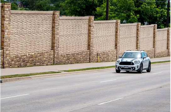
Figure 4-11: Wall Cap Elevation Changes
4.2.3 Wall Finishes
Since walls are strong vertical elements, they can dominate the field of view. The color, texture, and pattern have a commanding influence on driver perception of the highway landscape. The opposite side of the wall must be considered as well and designed with the impact to adjacent properties in mind (see
).
The size of the roadway creates a relationship between color, texture, pattern, and scale that should be noted. To be appreciated, a color, pattern, or texture must be visible. The size of treated areas should not be so small as to have little visual effect. Inversely, too much of a single treatment can become boring or overpowering. There are no hard-and-fast rules to determine when these lines have been crossed but in general, special treatments should accent rather than dominate a landscape scene.
Depending upon the color, texture, and pattern selected, the wall will either blend or contrast with the background landscape. Always reference back to the LAMP (see
) to ensure that selections are in keeping with the overall vision for the corridor (see
).
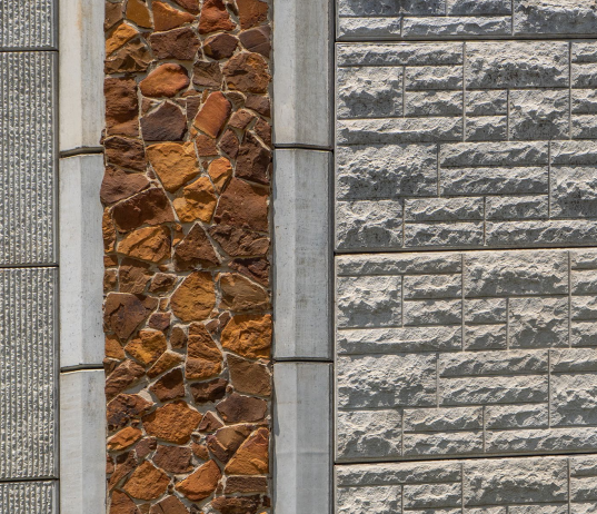
Figure 4-12: Wall Finishes, Bastrop SH 71 at Chestnut
4.2.3.1 Color
Along the highway side, wall colors should be selected to blend and complement the natural surroundings. When adjacent to residential neighborhoods, colors should be muted so that they do not conflict with the appearance of the residences (see
and
).
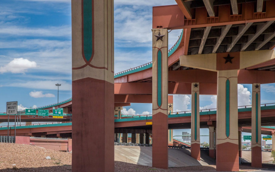
Figure 4-13: Wall Color and Graphics
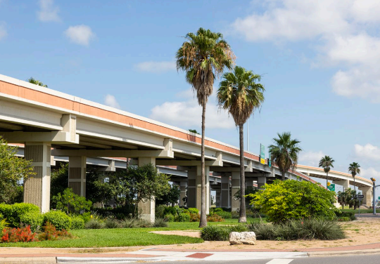
Figure 4-14: Color can visually unite different structures in a scene.
4.2.3.2 Finishes, Textures, and Patterns
Textures are most visually effective where traffic speeds are slower (controlled intersections) or where structures are close to the travel lane. Textures should be rougher if they are to be seen from longer distances. Rougher textures create more shadows on their surfaces and so create a high contrast with the sunlit areas of the surface, thereby providing a more visually prominent surface.
Textures on concrete may be achieved using form-liners, sandblasting, or washing to expose the integral aggregate. The malleability of concrete allows unique patterns to be included in the design at a reasonable cost (see
and
).
Special finish options for vertical surfaces include:
- Form liners;
- Sandblasting;
- Pigmented coatings;
- Integral color;
- Architectural veneers; and
- Modular structural units.
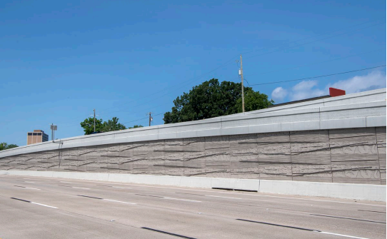
Figure 4-15: Textures on Concrete
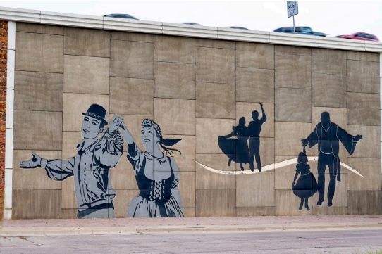
Figure 4-16: Wall Finishes, Textures, and Patterns
Form Liners
Common form liner patterns include raised or indented vertical patterns as well as brick and stone. Strong vertically oriented textures will emphasize the height of structures while horizontal textures will de-emphasize height and highlight the structure’s linear character.
Pattern choices should complement the wall surroundings. A heavily developed urban area may suggest a formal architectural pattern, while rural areas or locations with prominent natural features may warrant the use of form liner patterns suggestive of local native materials (see
).
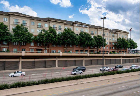
Figure 4-17: Form liners incorporated with architectural details create interesting patterns.
Sandblasting
Sandblasting may be used as a relatively inexpensive method of adding a softer textural interest. These textures will not be visible at long distances since sandblasting only affects a shallow depth of the surface. Consequently, this technique is best used where traffic speeds are lower, and the walls are near the travel lane.
Sandblasting entire surfaces may make the walls less distinct and blend into the background. A band of untreated surface at the edges of the wall will prevent this and make the texture contrast more visually effective.
Pigmented Coatings (Paints and Stains)
Pigmented coatings are a relatively inexpensive method of adding visual interest to structures. Paints have proven to be less durable than stains, requiring reapplication due to flaking, and are not recommended for concrete structures. Paints also fade significantly over time, so the use of darker color paints should be considered if painting is desired. Acrylic stains have proven to be much more long-lived in concrete applications and are available in a wide range of colors.
Stains are affected by the quality of the surface before application. Surface imperfections due to damage or to inadequate vibration during pouring will be clearly visible once the stain is applied.
Anti-graffiti Finish
To deter/minimize the impact of vandalism on hard surface improvements in the ROW and its other facilities, TxDOT encourages the use of anti-graffiti coating products in its projects. These coatings may be either Type II (Solvent-Cleanable) or Type III (Water-Cleanable). Care should be taken to follow
along with manufacturer’s recommendations in applying the coating. TxDOT has found that some anti-graffiti coatings have tended to stain and/or fade some original paint colors if not applied appropriately.
Integral Color
Integral color infuses the entire quantity of concrete used in the wall. Variation in the quality of concrete can result in different shades of color, so matching earlier pours becomes very difficult when adding new sections or repairing existing damaged areas.
Architectural Veneers
Non-structural veneers of various materials may be installed over other wall structural materials. The veneers may be stone, modular concrete block, or brick, and in some cases, tile. Veneers may be useful in creating visual links between unconnected elements by retrofitting some portions of wall surfaces with the same material.
Modular Structural Units
Modular units are most prominent in the use of pre-cast panel, Retained Earth Walls. A smaller unit scale is found in Modular Block retaining wall systems. These systems impart patterns to wall surfaces that provide visual interest and help prevent large surfaces from becoming oppressively monotonous.
The patterns provided by these systems can result from two components: the shape of the modular unit and the pattern created by the arrangement of different colored or textured units. The scale of the structure and the type of unit affect the decision to add pattern in this way (see
).
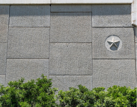
Figure 4-18: Deep shadow lines increase the distance at which texture can be perceived.