Section
3: Guide Sign Lettering
Letter Style
Sign lettering for word messages on freeway guide signs is uppercase, with the exception of destinations (names of places, streets, and highways). All destinations on guide signs must be composed of lowercase letters with initial uppercase letters. Since the 1950s, the Highway Series alphabet has been used as the letter style for freeway guide signs. The Series E (Modified) alphabet is the letter style that is most commonly associated with freeway signs. In the late 1990s and early 2000s, TxDOT began researching the performance of a different alphabet for freeway guide signs. This alphabet (or font) is known as Clearview, and it is available in several different stroke widths. In 2003, TxDOT decided to implement Clearview as the standard font for all freeway guide signs (white on green, white on blue, and white on brown). All of the guide signs illustrated in this handbook use Clearview for the white part of the sign legend.
Clearview is available in several different stroke widths. Clearview 5WR is used for the white legend in Exit Direction and Advance Guide signs. Other styles of Clearview are used in other types of white on green signs. Figure 4‑9 illustrates the letters and numbers for Clearview 5WR.
Several unique features to the Clearview font make it different from the traditional highway alphabet:
- The loop height (or x-height) of the lowercase letters is greater than the 75 percent associated with the highway alphabet.
- The letter height is not independently specified for lowercase letters.
- The lowercase ascender letters (b, d, f, h, k, l, and t) are taller than an uppercase letter of the same height.
- The fractions are taller than an uppercase letter of the same height.
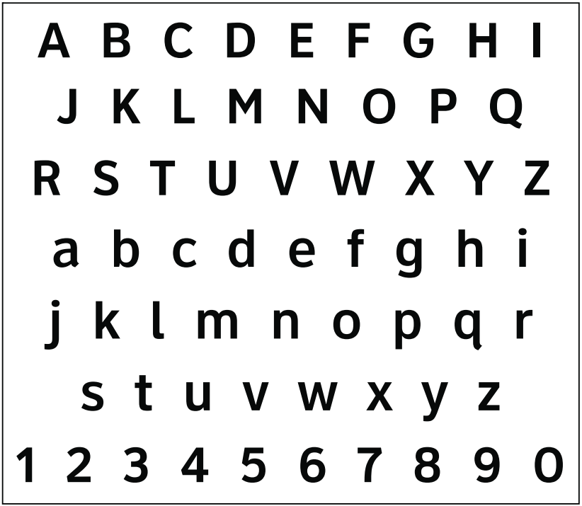
Figure 4-9. Clearview 5WR font for white legend on freeway guide signs.
Letter Size
The Texas MUTCD provides guidance as to the letter height on guide signs. For freeway guide signs, the message dimensions and letter size must be determined first, and the outside dimensions second. Lettering size on freeway signs is dependent on the type of interchange or sign, and must be the same for both rural and urban conditions.
Letter and numeral sizes for freeway guide signs according to interchange classification and component of sign legend are given in the Texas MUTCD. The minimum and desirable sizes for sign elements on Advance Guide and Exit Direction signs are shown in the following table. The minimum sizes for sign elements on other types of freeway signs are provided in Chapter 3.
Type of Sign and Sign Elements | Minimum Height (inches) | Letter Style | ||||
|---|---|---|---|---|---|---|
Exit Panel | ||||||
Word | 10 | CV 4W | ||||
Numeral and Letter | 15 | CV 4W | ||||
Interstate Route Sign | ||||||
Numeral 1 | 18 | D | ||||
Shield (1-2 Digit) | 36 × 36 | — | ||||
Shield (3 Digit) | 45 × 36 | — | ||||
U.S. or State Route Sign, Business, Loop, or Spur Interstate Route Sign | ||||||
Numeral 1 | 18 | D | ||||
Shield (1-2 Digit) | 36 × 36 | — | ||||
Shield (3 Digit) | 45 × 36 | — | ||||
Or Alternative (Ex: U.S. 56) | ||||||
Initials | 12 | CV 5WR | ||||
Numerals | 15 | CV 5WR | ||||
Cardinal Direction | ||||||
Word 2 | 12 | CV 5WR | ||||
“BUSINESS” | ||||||
Word | 10 | CV 5WR | ||||
Name of Place, Street, or Highway | ||||||
Word | 16 | CV 5WR | ||||
Distance Message | ||||||
Numeral | 15 | CV 5WR | ||||
Fraction | 10 | CV 5WR | ||||
Word | 10 | CV 5WR | ||||
NOTES: 1. In a few cases numerals cannot be accommodated within the space available. For these cases, the standard series D numeral may be reduced to C, or as a second choice to the next smaller height commonly available. 2. It is Texas practice that the entire cardinal direction word be the same letter size. | ||||||
Examples of letter style and minimum letter and numeral sizes on an Advance Guide sign are shown in Figure 4‑10.
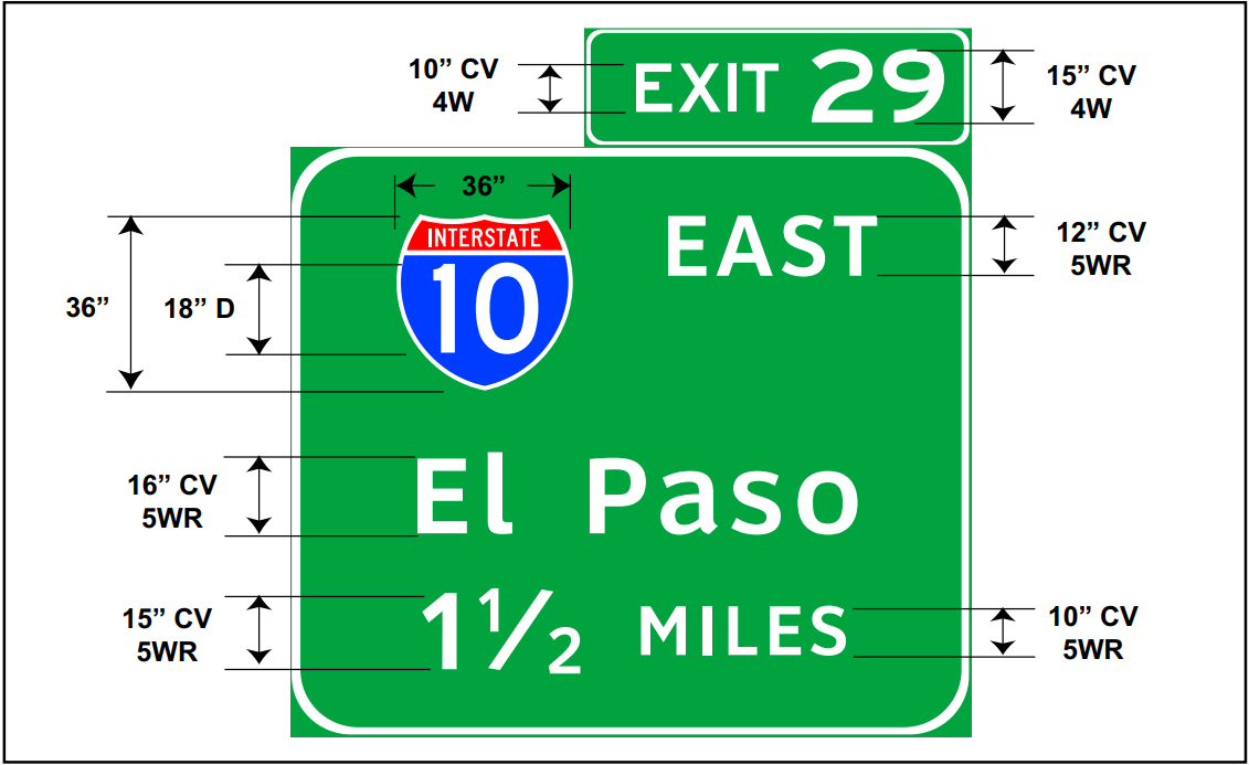
Figure 4-10. Letter style and minimum letter and numeral sizes on an Advance Guide sign.
Letter Spacing
The amount of space between letters and numerals in a word
message varies with the shape, size, and style of letters. The Clearview
5WR alphabet has been developed with extensive letter spacing combinations
to optimize the legibility of individual letter combinations. The
letter spacing built into the Clearview font should be used for
the design and fabrication of freeway guide signs.